
New emulsions are new distractions. They often lead to the same place over a broken trail, which is why I spend very little of my time with them. There are more excuses than bullets in the darkroom. I tested many papers and developers about 5 years ago, and over the years I have printed on papers from nearly a dozen companies. None of them solved all problems nor, more importantly, presented new ideas. Nothing increases vocabulary by providing a variant spelling.
Foma is a favorite paper maker. I particularly like the hand feel to their papers; this makes the time spent in the studio satisfying.
To test a paper, I make use of a simple, easily reproduced setup — this allows me to compare papers. I use Stouffer step wedges (uncalibrated). I also setup my enlarger the same, even though I make a ‘contact’ print of the Stouffer TP120, the same lens and distance from the contact frame mean my exposures reveal how the paper will print negatives typical to my work.

A new paper is an unknown; but not a complete unknown, since the main emulsion companies publish a paper Iso(P) and iso(R) of their papers. [See the reference for what this means.]
According to the datasheet this paper has a paper iso(p) of 100; this makes the paper about the speed of Ilford MG 4 Filter. With that information, I can check my notes for exposure settings in my darkroom conditions for a IMG 4 filter; set the enlarger to that as an initial point and, make a first test exposure. Done.
I will test this paper in two different developers: Dektol (1:1, my standard), and Fomatol PW (1:1, my standard). The Foma PW developer is vary slow acting warmtone developer.
The time for Dektol was 2 minutes; time for PW was at first 5 minutes — this was increased in later tests to 7 minutes.
The test with Dektol went well — I wasn’t satisfied by the Fomatol version, so I ran them again with newer developer package. This gave me much better depth of tone with 6 minute development time. Better.


Dektol gives a neutral range of tones. Highlights showing the characteristic of this paper. To take advantage of this ‘retro’ look, the image needs middle value meaning, since that is where the distinctive color of the paper will be.
Not the case for Foma PW developer. Retrobrom paper in Foma PW is another rich brown tone paper. The brown is ‘woody green’ in my estimate. It is not ‘green’ toned — for whatever reason, Foma describes it as having a green tone, which among several online pieces I’ve read, keep the author from trying the paper.
At this stage, I am ready to print. Testing done; about 6 hours, including drying, evaluating and write-up. I will also try this with lith printing… but won’t report additionally.
These techday notes are not fulfilling enough to me.
REF:
* the ISO-P rating gives the speed of the paper: double ISO value means half of the exposure time. Unfortunately exposure meters that are calibrated in ISO-P values are hard to find. This ISO-P value has nothing to do with the ISO rating of your rolls.
* the ISO-R rating gives the grade of the paper: ISO-R divided by 100 is equal to log(D), which defines the contrast behavior of the paper. E.g. Ilford Multigrade IV has an ISO-R range of 130 for grade 1 and 90 for grade 3 (see details in data sheets, that come with the paper). The higher the ISO-R value, the lower the contrast of the print.
Fomatol PW review on webionaire.
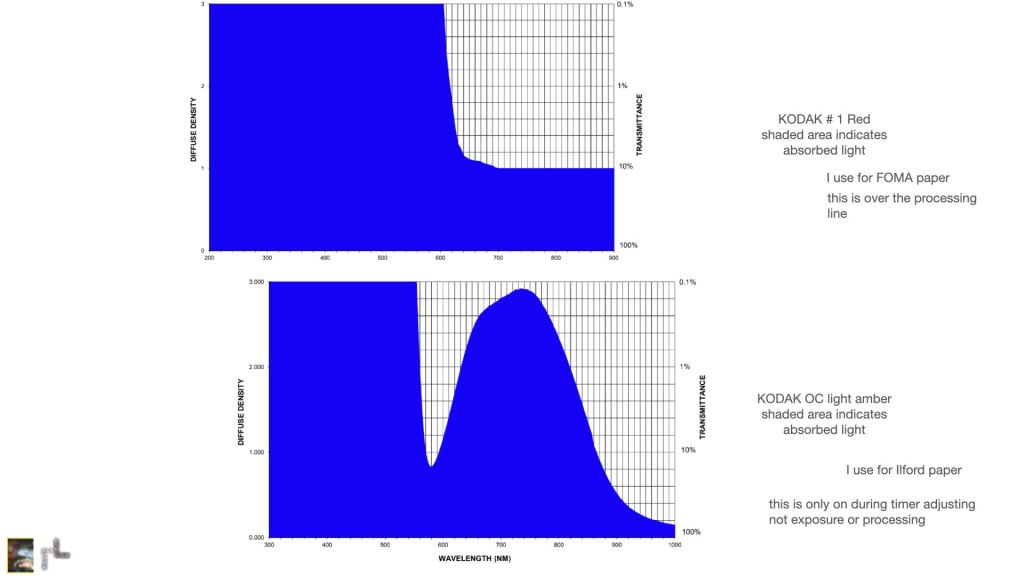
Safelights: check them. use them sparingly. I don’t hang them from the ceiling, since I have never had to find anything on the ceiling. I use them as task lights.
Characterizing Paper: Labnotes
Packaged developers can be modified. In the 1970s the following chems were used as addenda to Kodak, Ansco, Ilford print developers:
- Hydroquinone, 4oz
- Potassium bromide, 1-4 ounces
- DuPont BB solution, or Kodak Anti-Fog No.1, also AF No.2
- Elon (Metol), 1 pound
- Sodium Sulfite, 5 pounds
- Sodium Carbonate, 1 pound
- Borax, 1 pound
Webionaire Posts about Foma …
- https://webionaire.com/2017/04/28/fomabrom-variant-iv-123-bo/
- https://webionaire.com/2016/12/25/warmtone-bullets/

You must be logged in to post a comment.